Why customer psychology matters more than prettier web design
Most customers aren't looking for a prettier website. They're trying to clear enough doubt to feel confident getting in touch.
When a local business decides to invest in their website, the conversation usually starts with how it looks. New colours, cleaner layout, better images, a more modern feel. Those things can help. But they are not why most customers get in touch, and they are rarely why customers leave without enquiring either.
People leave a local business website for psychological reasons more often than visual ones. They could not find what they needed quickly enough. They were not sure the business was genuine. They did not know what the next step was. They felt a vague discomfort they could not quite pin down, went back to the search results, and tried someone else.
Understanding that beats chasing the latest design trend.
What customers are actually doing on your site
When someone lands on a local business website, they are not browsing for pleasure. They have come from Google, Google Maps, a review site, or a recommendation, and they are trying to answer a few specific questions as quickly as possible.
Those questions are almost always the same. Do you do what I need? Do you cover my area? Can I contact you easily? Do you look like a real, active business? Can I trust you enough to take the next step?
Google asks businesses to keep practical details such as hours, phone number, location and business information complete and accurate. That is useful because it gives a customer something clear to check. The website's job is to answer practical questions and build enough confidence for the visitor to act. That is the customer view behind how I help.
If your website makes that process easy, the design matters less than you might think. If it makes it hard, even a handsome site will not save you.
The four things that stop enquiries
From the evidence on customer behaviour and frustrations, four barriers keep coming up when people research local businesses online. Each is a form of friction, and each has practical causes.
Uncertainty. The customer cannot find the information they need. Your services are vague, your coverage area is not mentioned, or there is not enough detail to tell whether you are the right fit. Guessing feels uncomfortable enough to make them leave. Ofcom reports that smartphones account for around three quarters of UK adults' online time, so buried or poorly structured information is especially awkward on a small screen.
Distrust. Something about the website makes the customer feel uneasy. Maybe it looks outdated, or there are no reviews or testimonials visible. Maybe the details do not match what they saw on Google. Maybe there is no indication of who is behind the business. In BrightLocal's 2023 US consumer research, 62% said they would avoid a business after finding incorrect information online, and 63% said mostly negative written reviews would reduce their trust. Distrust does not need a dramatic cause. A subtle feeling that something is off is often enough.
Delay. The customer was ready to act, but the website made it too hard. The phone number is buried, the contact form is long, the site loads slowly, or there is no clear indication of what to do next. That moment of readiness is fragile. If the path from "I'm interested" to "I've made contact" takes too many clicks or too much scrolling, people drop off.
Mental effort. The customer has to work too hard to understand what the business does or whether it is right for them. This overlaps with uncertainty, but it is slightly different. The site asks the visitor to read too much, decode too much, or figure out too much before they can make a simple decision. Local customers are not doing research projects. They want quick clarity.
Why design alone doesn't fix these
A new design can make a website more visually appealing, and visual quality does affect perceived trustworthiness. Nielsen Norman Group's trust research treats design as one factor in how credible a site feels. That part is real.
But a redesign that focuses on appearance without addressing the four barriers above will often produce a better-looking website that still loses the same customers for the same reasons. If the service descriptions are still vague, the contact details are still hard to find, and the site still does not match what Google shows, a nicer colour scheme does not change the outcome.
The businesses that turn interest into enquiries are the ones where someone has thought about the visit from the customer's side. Not "does this look professional?" but "can someone on a phone, in a hurry, with three other tabs open, find what they need and feel confident enough to get in touch?"
What actually reduces friction
The practical fixes are unglamorous, and they work.
Clear service descriptions. Not marketing copy, just a plain explanation of what you do. Specific enough that a customer can tell immediately whether you offer what they need. "We install and repair domestic boilers across Teesside" works. "Quality heating solutions" does not.
Visible contact details. Phone number and email on every page, not hidden behind a menu. On mobile, the number should be tappable. If you use a form, keep it short. Fewer fields usually means more responses.
Consistency with other platforms. If your Google listing says you are open until six and your website says five, customers notice, even if they cannot say why it made them uneasy. Same hours, same number, same services, everywhere. The Get Found overview explains the visibility side of that work.
Proof you are real and active. Photos of actual work, honest testimonials, trade body logos, insurance details. Not an essay, just enough evidence that a sceptical customer can see you are legitimate. A website that has not been updated in two years sends the wrong signal, even if the business is busy.
A clear next step. Every page should make it obvious what the customer should do next. Call, email, fill in a form, request a quote. If they have to work out how to contact you, some of them will not. A customer-view review can make those gaps visible before a redesign is even on the table.
Thinking like the customer
The biggest shift a business owner can make is not hiring a better designer. It is looking at their own website the way a stranger would on a phone: someone who has never heard of the business, has three other options to check, and will decide in under a minute.
That perspective is uncomfortable because it shows what is missing, what is unclear, and what might be putting people off. It is also the perspective that turns a website from a digital brochure into something that generates enquiries.
The next time you think about your website, try not to start with how it looks. Start with what it asks a stranger to do, and whether it makes that easy enough. The Get Chosen overview sets out the wider decision-path checks. That way of looking at the site beats most redesigns.
Related posts
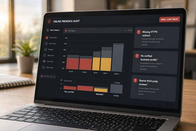
How to make a local service business look clearly legitimate online
A practical checklist for trades, home services and professional firms that need customers to trust them quickly before getting in touch.
Read next
Fake reviews, real damage
Fake reviews damage customer trust and distort competition for honest businesses. Here's what the evidence says and what you can do about it.
Read next
Why Middlesbrough firms cannot afford weak trust signals
In Middlesbrough every local enquiry counts. Weak trust signals online cost businesses customers they can't afford to lose.
Read next