What one in five smartphone-only users means for local websites
One in five UK adults only go online on their phone. If your website is awkward on a small screen, a large share of your customers will struggle to use it.
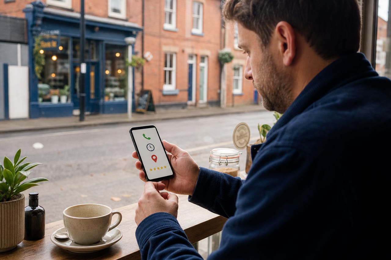
Most business owners know their website should work on a phone. Fewer stop to ask what that actually means for the person trying to use it.
Ofcom's research shows that one in five online adults in the UK rely solely on a smartphone for internet access. They don't have a laptop at home, they don't sit at a desktop, and they aren't going to check your website later on a bigger screen. The phone is how they do everything online.
Combine that with smartphones accounting for 77% of all UK adults' online time, and the practical point is hard to miss. If your website doesn't work well on a small screen, a sizeable number of potential customers will struggle to use it at all.
"Mobile-friendly" doesn't just mean the layout adjusts
When web designers talk about mobile-friendly, they usually mean responsive design: the layout rearranges itself so it fits a phone screen rather than looking like a shrunken desktop site. That is the bare minimum, and most modern websites do it by default.
For a local business, being useful on a phone goes further. A customer on their phone is rarely browsing for fun. They want your phone number, whether you cover their area, whether you do the job they need, whether you are open, or a way to get in touch. They want answers, not a tour of your brand.
Google's research into UK local search behaviour found that business hours and contact details were among the most commonly searched local details, and that local searches often led to follow-up action quickly. That research is older now, but the behaviour it describes has only become more common. People search on their phone, they find you (or don't), and they act, all within a few minutes.
What phone-only users are actually dealing with
Think about using a local business website on a phone, honestly. Not how it looks in your website builder's preview mode, but how it works when someone is standing outside, sitting on the bus, or trying to sort something out while the kids are making noise.
Common frustrations that come up in consumer research and online discussions about local businesses include contact details that are hard to find or buried in a menu, pages that take too long to load on mobile data, text that is too small or too cramped to read comfortably, phone numbers that aren't tappable (so you have to memorise them and switch apps), and service descriptions so vague that you still don't know if the business does what you need.
These aren't problems that only affect people who are "bad with technology." They are basic usability issues that make it harder for anyone to use your site in the setting where most local searches happen.
The gap between "it works on mobile" and "it works for mobile customers"
This is the distinction that gets missed most often. A site can technically work on a phone (everything loads, nothing looks broken) and still be a poor experience for someone trying to make a quick decision.
WebAIM's 2026 analysis of one million homepages found detectable accessibility errors on 94.8% of them, averaging 56.1 errors per page. Accessibility and mobile usability overlap heavily, because many of the same issues (small tap targets, poor contrast, missing labels, confusing navigation) affect both. A site that is hard to use for someone with a visual impairment is often also hard to use for someone squinting at a phone in bright sunlight.
What local businesses should actually check
If you want to know whether your site works for phone users, test a few practical things. Don't only look at it in preview mode. Use it on your own phone and try to complete the tasks your customers would.
Can someone find your phone number within a few seconds? It should be visible without opening a menu, and ideally tappable from the homepage. If a customer has to scroll or hunt, you will lose some of them.
Do your services make sense on a small screen? Long paragraphs that work fine on desktop can become walls of grey on a phone. Break things up. Use clear headings. Make it scannable so someone can quickly find the bit that matters to them.
Is your contact method easy to use? If you have a form, does it work well on a phone? Are the fields big enough to tap? Does it ask for too much information upfront? A simpler form usually gets more responses than a long one.
Does your site load quickly on mobile data? Not everyone is on fast wifi. Large images, unnecessary scripts, and heavy page designs all slow things down, and slow pages lose people.
Do your opening hours appear without having to dig for them? For businesses where availability matters (shops, salons, cafes, clinics, any service with set hours), your hours should be visible on the homepage or very close to it. Ofcom's data on smartphone-only users makes this even more important: these customers may not have another way to check.
This isn't about perfection
No website is perfect on every device, and nobody expects a local joiner or accountant to match Amazon on mobile. The bar for "good enough" is fairly low: clear contact details, readable text, a phone number you can tap, a straightforward explanation of what you do, and a simple way to get in touch. That covers most of what a mobile customer needs.
The businesses that lose out aren't usually the ones with ugly websites. They are the ones that make it just slightly too hard to find the answer or take the next step. On a phone, "slightly too hard" is enough to send someone back to the search results.
If you're not sure how your site holds up, try it yourself. Open it on your mobile, pretend you've never heard of your business, and try to answer the basics in under thirty seconds: what do they do, where are they, are they open, and how do I contact them? The basic business information guide gives you the same check from the customer's side. If you can't answer those questions, your customers probably can't either. The Get Chosen overview explains how that friction affects the wider route to an enquiry.
Related posts
Do I Need a Website If My Business Already Has a Facebook Page?
Facebook is useful for local businesses, but is it enough on its own? When a small business still needs a website, and what a simple site can add.
Read next
Why your website loses leads after good reviews
Good reviews get people interested. If your website doesn't keep that trust going, they leave before they ever contact you.
Read next