What they need to trust
Reviews, credentials, guarantees, local cues and proof are placed where they reduce doubt.
Demo website gallery
These are demo examples, not client case studies. They show different ways a site can help customers understand what you do, trust what they see, and get in touch.
Not a template exercise
Before a real build, the page structure, wording, proof, photos and contact routes are shaped around what your customers need to see before they choose you. The examples below are starting points for style and layout, not fixed templates with your logo dropped in.
Reviews, credentials, guarantees, local cues and proof are placed where they reduce doubt.
Services, prices, areas, process and next steps are ordered so people are not left guessing.
Calls, forms, booking links and quote routes are designed around how that customer actually enquires.
What the demos show
Use these examples to spot the direction that feels closest to your business. The final site would be written, structured and refined around your actual customers.
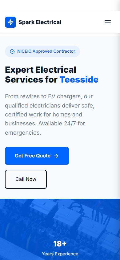
Shows how urgent contact routes, safety cues and service clarity can work together on mobile.
Good for: quick trust and click-to-call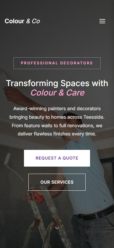
Shows how finish quality, portfolio imagery and a calmer tone can make visual work feel trustworthy.
Good for: proof and finish quality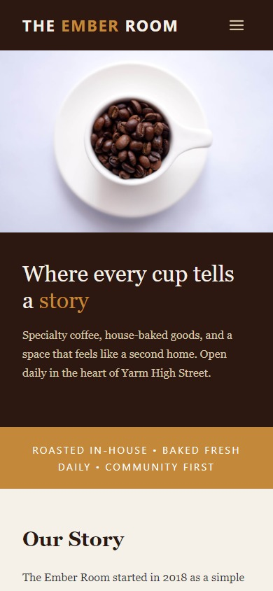
Shows how atmosphere, menu cues, opening context and imagery can help people decide to visit.
Good for: atmosphere and visits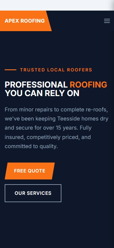
Shows how strong service sections, repair urgency and practical trust signals can support quote enquiries.
Good for: services and quote confidenceThe important bit
These examples help you see possible directions. A real Local Roots Digital site starts with your business, your customers, and the questions they need answered before they call.
Start with your situation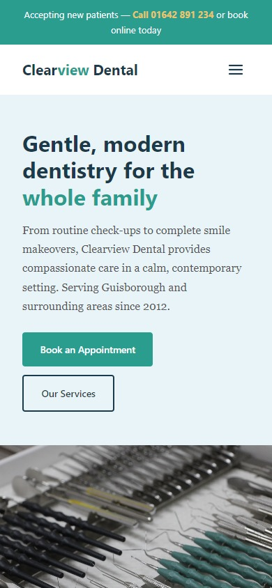
Shows how reassurance, treatment clarity and softer visual choices can reduce anxiety before booking.
Good for: reassurance and booking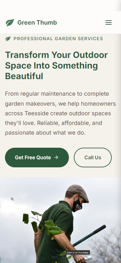
Shows how clear service cards and local outdoor imagery can help customers understand what is covered.
Good for: service clarity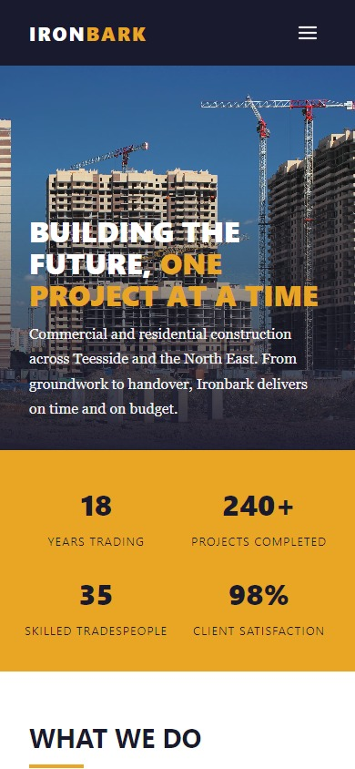
Shows how project scale, process and capability can be presented without making the page feel corporate.
Good for: project confidence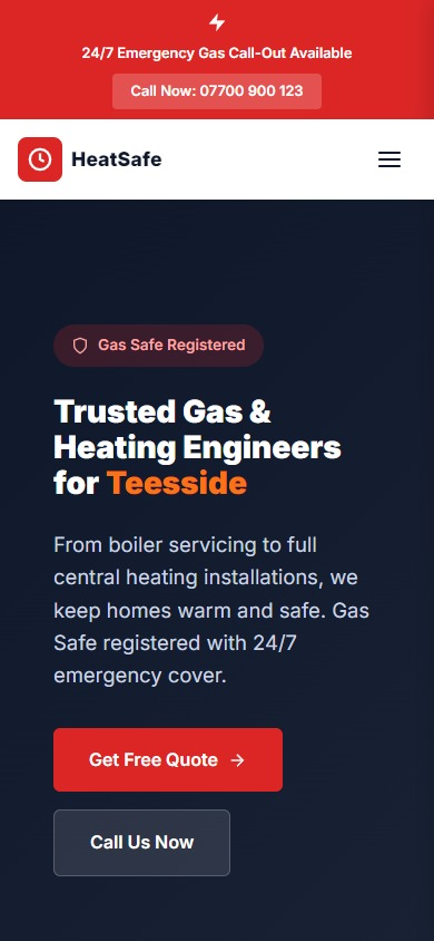
Shows how credentials, emergency cues and everyday services can sit together without confusing the visitor.
Good for: urgent and planned workReady when you are
You do not need to pick a design from this page. Tell me where your business is now and what customers need to understand before they contact you, and I will point you towards the simplest sensible next step.